14. Reporting
The last mile: turning a validated model into things people look at. The
package draws every figure twice, deliberately. A matplotlib family
(Explorer) is for print, and a plotly family (Interactive) carries the
same figures under the same names for looking at, plus a dashboard that
links them. The arithmetic behind both lives in one backend-free module,
so the printed figure and the interactive one can never quietly disagree.
The running example is Jura’s seven elements, scored where reporting should score them: on the held-out validation set.
import os
import tempfile

import geoml
import numpy as np

os.makedirs("figures", exist_ok=True)
geoml.set_seed(1234)

jura_train, jura_validation = geoml.datasets.jura()
n_el = len(jura_train.get("Elements").labels)

root = geoml.latent.BasicInput(
    inducing_points=jura_train,
    transform=geoml.transform.Isotropic(1.0))

gp = geoml.latent.BasicGP(
    root,
    size=n_el,
    kernel=geoml.kernels.Spherical())

# one likelihood serves any number of columns; the warping's size is what
# says how many there are
warping = geoml.warping.ChainedWarping(
    geoml.warping.Softplus(n_el),
    geoml.warping.ZScore(n_el))

model = geoml.models.VGPNetwork(
    jura_train, "Elements",
    geoml.likelihood.Gaussian(warping),
    gp,
    options=geoml.models.GPOptions(verbose=False))

model.train_full(max_iter=300)

model.predict(jura_validation, n_sim=30, include_noise=True)
14.1 The honest figures
Chapter 13 made the point, and here it pays off. jura_validation was
never trained on, so every comparison figure on it means what it shows.
That includes accuracy, which asks the model for measurement
intervals, and may be used here without the caveat it carries on training
data.
explore = geoml.plots.Explorer(jura_validation, continuous="Elements",
                               model=model)

figure = explore.accuracy()
figure.savefig("figures/14-accuracy.png", dpi=150, bbox_inches="tight")

figure = explore.prediction_scatter(trim=[0, 0.95])
figure.savefig("figures/14-scatter.png", dpi=150, bbox_inches="tight")
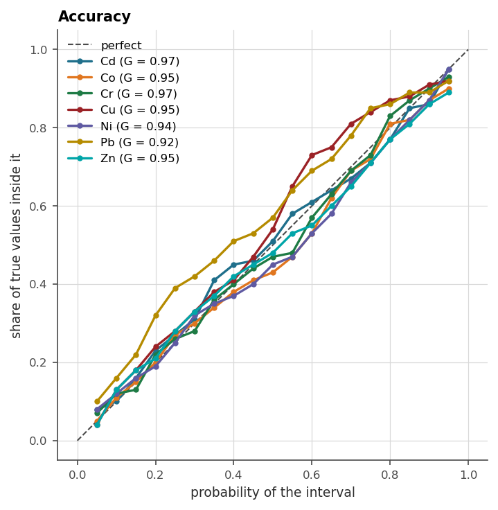
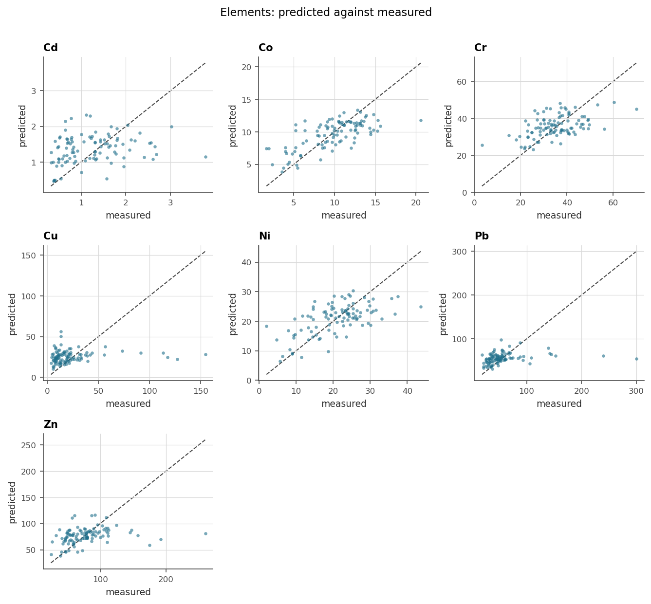
The accuracy plot is the geostatistician’s calibration check, and chapter
13 computes its number as goodness. The scatter is the figure everyone
asks for first and over-reads: its spread mixes model error with assay
noise, which is exactly why the accuracy plot sits beside it.
trim=[0, 0.95] ends each panel’s window at the 95th percentile, so the
few high assays beyond it no longer set the limits and press the rest of
the cloud into a corner. Each panel counts what it left out, four or five
of the hundred here. They are the high grades, where a smoothing estimator
falls furthest below the truth, so the scatter without trim is still the
one that shows that bias.
14.2 The dashboard
The plotly twins compose into a single self-contained HTML page with their selections linked, so clicking a population in the histogram lights up the same samples on the map. It renders in a notebook through an iframe and travels as one file that needs nothing installed.
board = geoml.plots.Interactive(
    jura_validation,
    continuous="Elements",
    categorical="Rock").dashboard(figures=("histogram", "scene"),
                                  plotlyjs="cdn")

path = board.write_html(
    os.path.join(tempfile.mkdtemp(), "jura-dashboard.html"))

print("dashboard written:", os.path.getsize(path) > 10000)
plotlyjs="cdn" keeps the file small by loading the plotting library from
the web. The default embeds it instead, for a page that works with no
connection at all, which is the right choice for a report that must open
in ten years.
14.3 What goes in a report, and where it came from
A defensible reporting set, chapter by chapter, all from one model:
item |
source |
|---|---|
block model with grades and their doubt |
chapters 8, 12 ( |
grade–tonnage with uncertainty |
chapter 8’s figure |
domain boundaries and grade shells as meshes |
chapter 12 ( |
validation scores and calibration |
chapter 13 ( |
calibration and scatter figures |
this chapter, on held-out data |
the model document itself |
|
The last row deserves more custom than it gets. The model’s own repr,
with every parameter, every bound and what was fixed, is the audit trail a
competent person signs against, and it costs one line to include.
In the code.
plots/explorer.pyandplots/interactive.pyhold the twin families,plots/prepare.pythe shared arithmetic, andplots/dashboard.pythe linked page.as_pyvista(...)on any container is the door to external 3D viewers.
Further reading
Chapter 15 assembles the full sequence, data to dashboard, on Walker Lake, and chapter 17 does it with the geometry of a real deposit in the way.