15. Case study: Walker Lake
The classic 2D benchmark, end to end: look at the data, build and train a
model, validate it where it never looked, calibrate what the validation
finds, and map the result. Everything here was introduced in Parts I and
II, and this chapter is the sequence, with the reasoning said at each
step. Walker Lake’s V is a non-negative variable with a long, thin right
tail, on 470 irregularly sampled locations, with a 78 000-node prediction
grid: small
enough to run in minutes, awkward enough to be honest.
15.1 Look first
import os

import geoml
import numpy as np

os.makedirs("figures", exist_ok=True)
geoml.set_seed(1234)

walker, walker_grid = geoml.datasets.walker()
print(walker.tree())

explore = geoml.plots.Explorer(walker, continuous="V")

explore.histogram().savefig("figures/15-histogram.png", dpi=150,
                            bbox_inches="tight")
explore.scene(clip=[0, 0.99]).savefig("figures/15-samples.png", dpi=150,
                                      bbox_inches="tight")
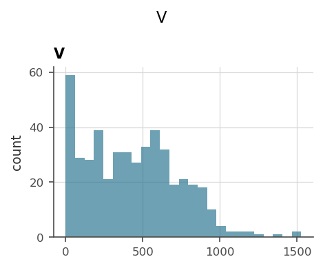
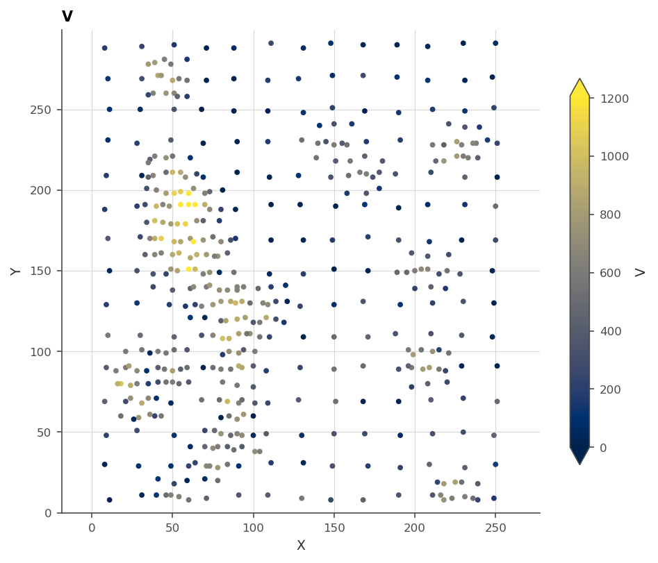
Two decisions fall straight out of looking. The long right tail and the pile of zeros want a power link that keeps the grade from going negative and trains its exponent (chapter 4), shifted by the order of the smallest positive value so that the zeros do not bend it (chapter 13), and the banded, uneven sampling means a random validation split would lie (chapter 13).
15.2 Build and train
The model of chapter 11, assembled one named piece at a time: inducing points on a 10-unit lattice over the prediction grid, cut into experts; a spherical kernel; and the chain that keeps a grade positive, shifted by one for the zeros.
experts = geoml.data.inducing.grid_experts(walker_grid, 10.0, block=8)

root = geoml.latent.BasicInput(
    experts,
    transform=geoml.transform.Isotropic(50))

gp = geoml.latent.BasicGP(
    root,
    size=1,
    kernel=geoml.kernels.Spherical())

warping = geoml.warping.ChainedWarping(
    geoml.warping.BoxCox(1, shift=1.0),
    geoml.warping.ZScore(1))

model = geoml.models.VGPNetwork(
    walker, "V",
    geoml.likelihood.Gaussian(warping),
    gp,
    options=geoml.models.GPOptions(verbose=False))

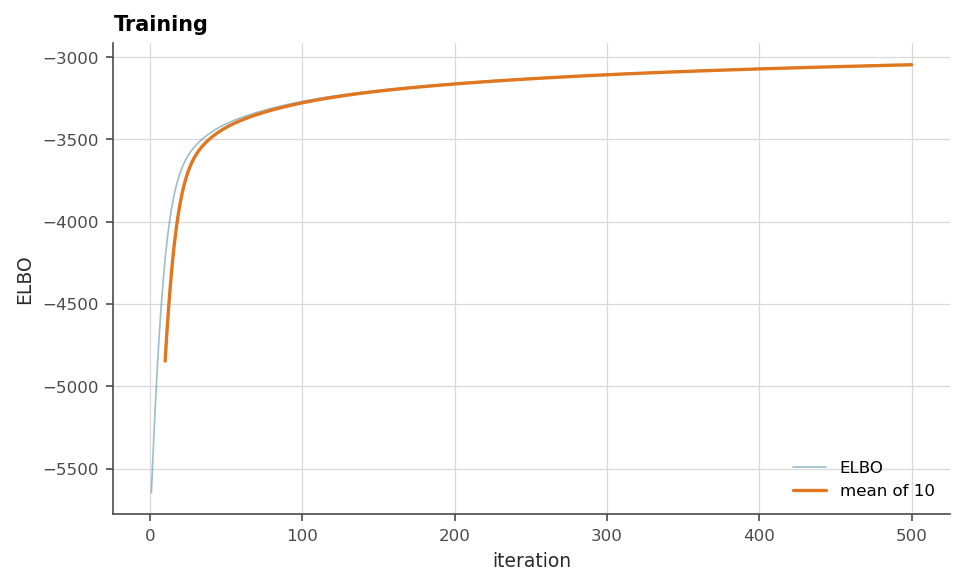
model.train_full(max_iter=500)

figure = geoml.plots.Explorer(walker, continuous="V",
                              model=model).training_curve()
figure.savefig("figures/15-training.png", dpi=150, bbox_inches="tight")
15.3 Validate, then calibrate
Folds built against the actual prediction grid, scored on measurements, and the interval claim checked. This is chapter 13 compressed to its practice.
w, target, achieved = walker.spatial_k_fold(walker_grid, k=5, seed=0)

oof, scores = geoml.models.cross_validate(model, iterations=200,
                                          n_sim=20)

print(scores[scores["fold"] == "all"][
    ["rmse", "mae", "bias", "crps", "goodness"]].round(2))

calibration = geoml.models.conformalize(oof, "V")
print("cut a '90%' interval at:", round(calibration.nominal(0.9), 3))

figure = geoml.plots.Explorer(oof, continuous="V").variogram(n_lags=12)
figure.savefig("figures/15-variogram.png", dpi=150, bbox_inches="tight")
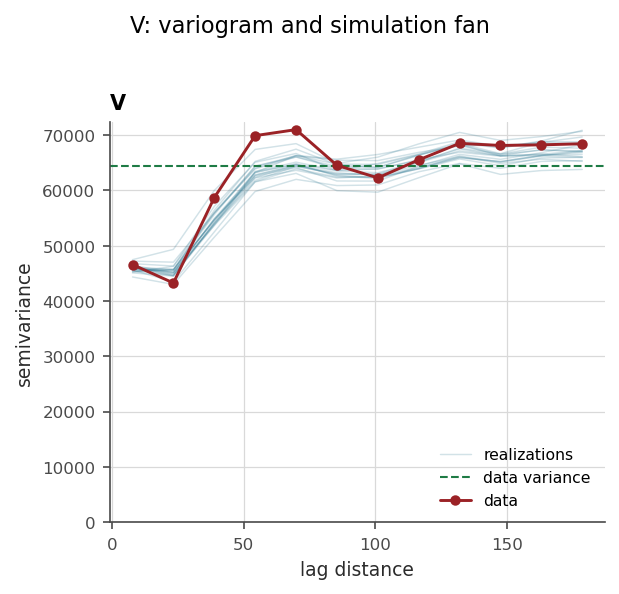
Three things to sign against. The pooled scores are the map’s expected error, measured where the model never looked. The calibration verdict says how wide a “90%” interval really has to be cut. And the variogram fan is the spatial check the other two cannot make: the realizations follow the data’s curve across the range and hold it at eight lags of the twelve, so the model walks like the ground rather than merely landing in the right place on average. That matters to a resource estimate, because a field fitted too smooth understates how often neighbouring blocks differ.
Both sides of that figure are corrected before they meet, and chapter 13 explains why at length. The fan is raised by the fitted noise, since the realizations are of the ground and the assays are not, and the pairs are declustered, since Walker Lake’s samples sit preferentially in high-value ground and a raw experimental variogram would describe the drilling rather than the deposit.
15.4 Map it
import matplotlib.pyplot as plt

model.predict(walker_grid, n_sim=50, include_noise=True)
walker_grid.get("V").reset_quantiles([0.05, 0.5, 0.95])

median = walker_grid.get("V/quantiles/0.5").as_image()
spread = walker_grid.get("V/quantiles/0.95").as_image() \
    - walker_grid.get("V/quantiles/0.05").as_image()

figure, axes = plt.subplots(1, 2, figsize=(9, 4.2), sharey=True)

for ax, image, title in zip(axes, [median, spread],
                            ["median", "0.05-0.95 spread"]):
    drawn = ax.imshow(image, origin="lower", cmap="cividis")
    figure.colorbar(drawn, ax=ax, shrink=0.8)
    ax.set_title(title)

figure.savefig("figures/15-maps.png", dpi=150, bbox_inches="tight")

print("lowest mapped value:",
      round(float(np.min(walker_grid.values("V/quantiles/0.05"))), 1))
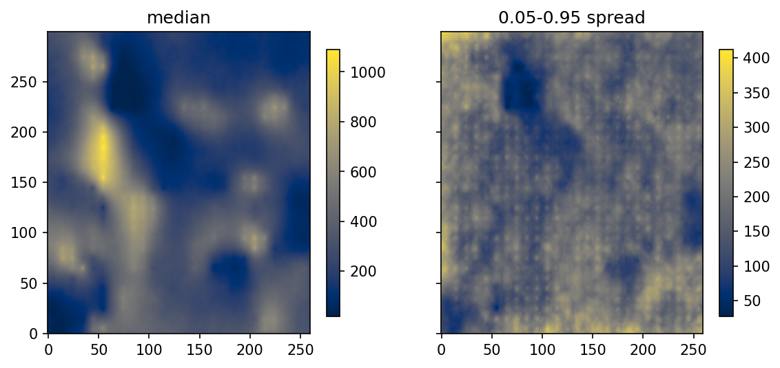
The two maps travel together on purpose. A median map alone answers “what is it”, while the spread beside it answers “where would drilling teach the most”, and the validated, calibrated intervals behind them are what make either worth acting on. The lowest mapped value is above zero, which chapter 2’s model could not promise and this warping chain can.
What this study did not need
No experimental variogram was fitted, because the model estimated its own and §15.3 checked it. No normal-score tables were built, because the warping is the transform and it is trained. No search neighbourhood was tuned, because the inducing points are the sparsity. The whole study is one seed, six objects and five figures, which is the point of the package and the reason this chapter fits on a few pages.